Overview
Background & Context
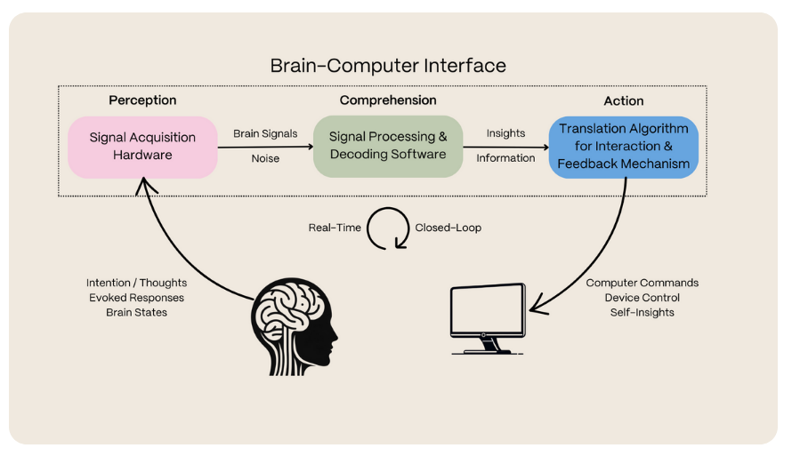
Arctop's brain signal technology translates neural data into actionable insights (provided by Arctop)
Original calibration flow from Arctop's app prior to the redesign (provided by Arctop)
Problem Statement
Fragmented Experience
Users struggled to navigate the app's various screens, making the overall experience feel disjointed and unclear.
Complex User Flow
The lack of clarity around calibration processes and metric unlocking made it difficult for users to engage effectively.
Brand Alignment
Ensuring every element of the design adhered to Arctop's brand guidelines while maintaining usability and consistency across the entire app.
Research & Strategy
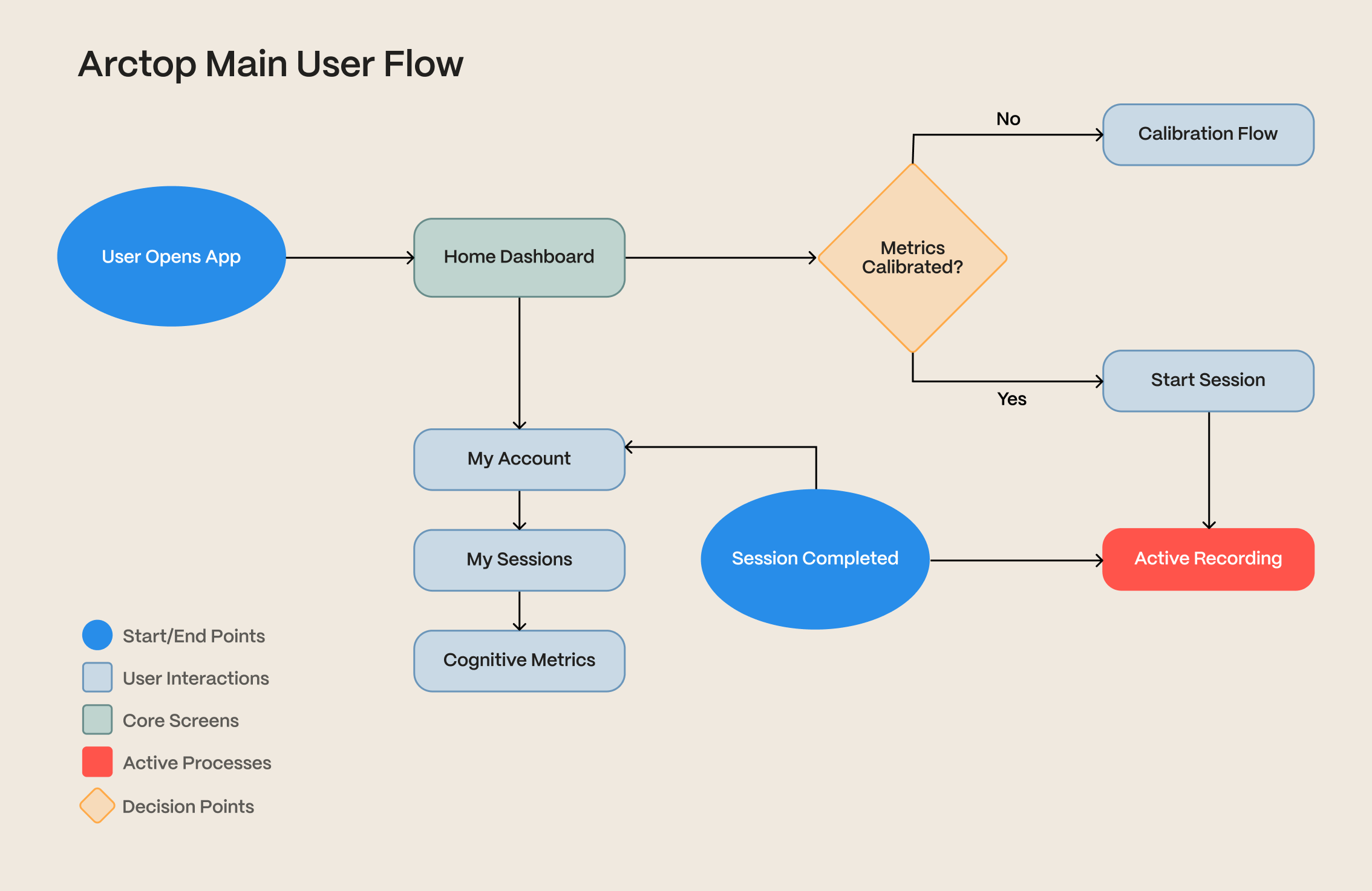
User journey mapping highlighted key touchpoints and opportunities
Design Process
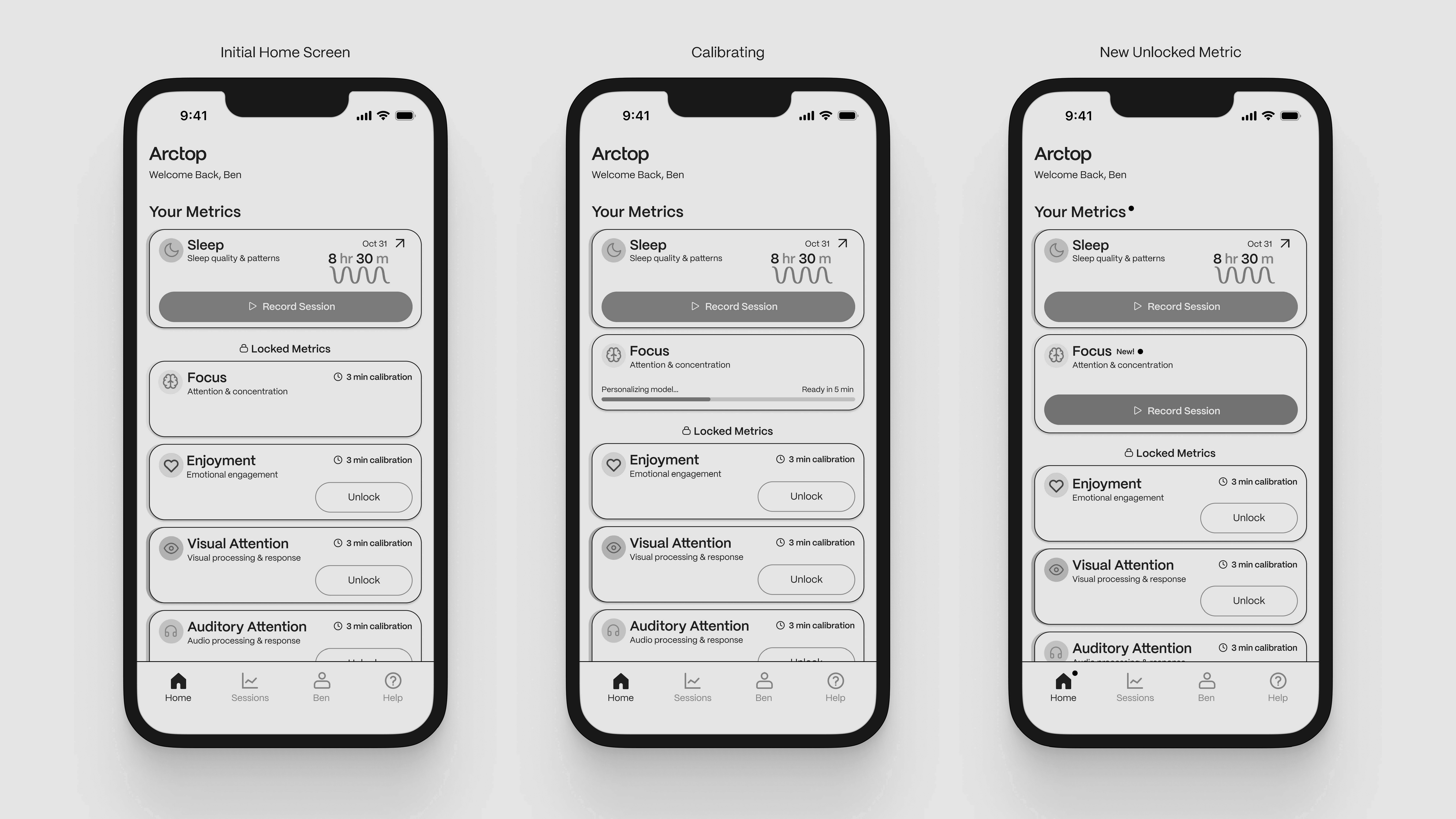
Wireframing
Created original wireframes to establish layout, flow, and hierarchy across all app screens.
Prototyping
Developed high-fidelity prototypes in Figma, focusing on a clean dashboard and dynamic calibration screens.
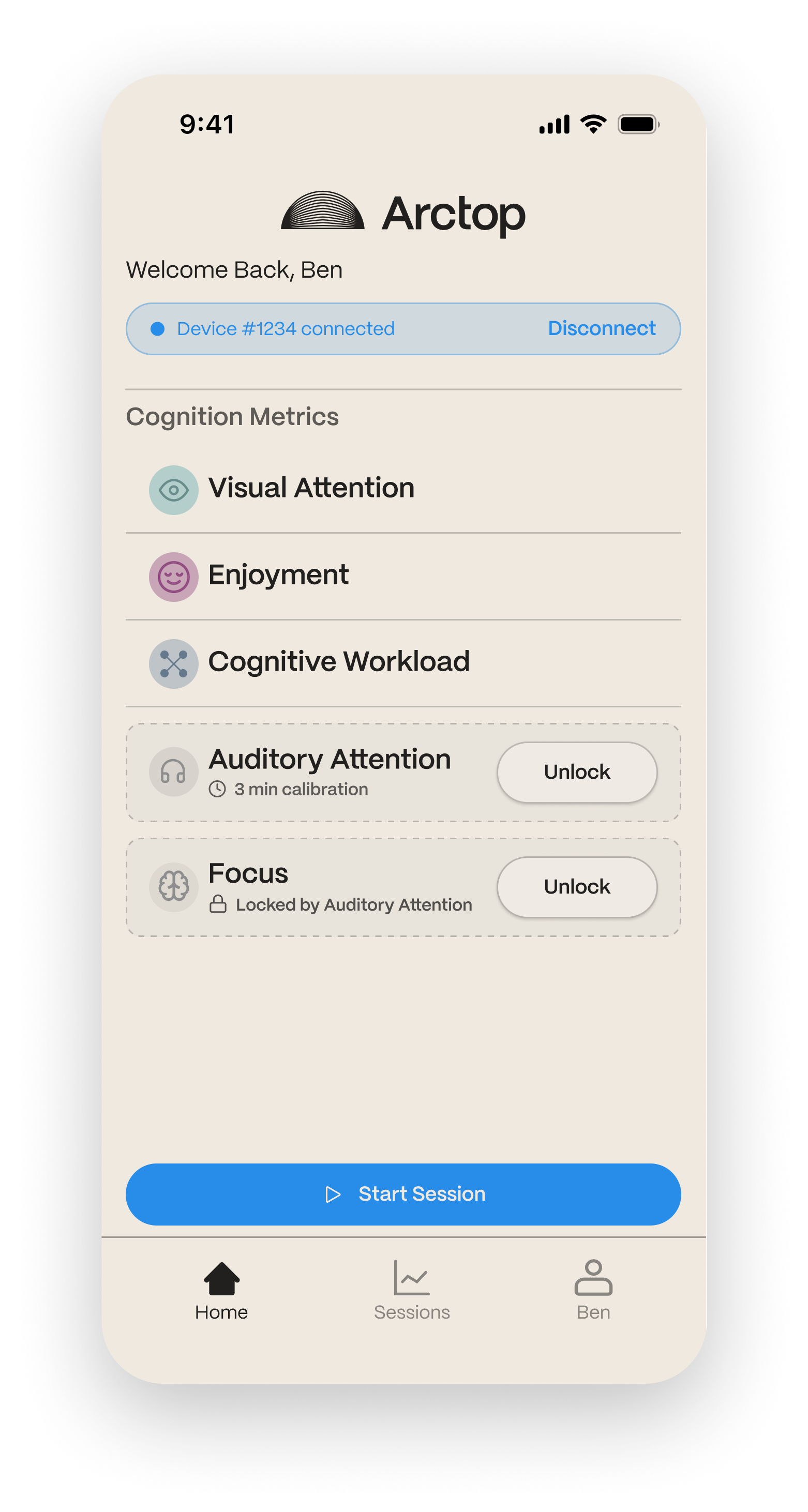
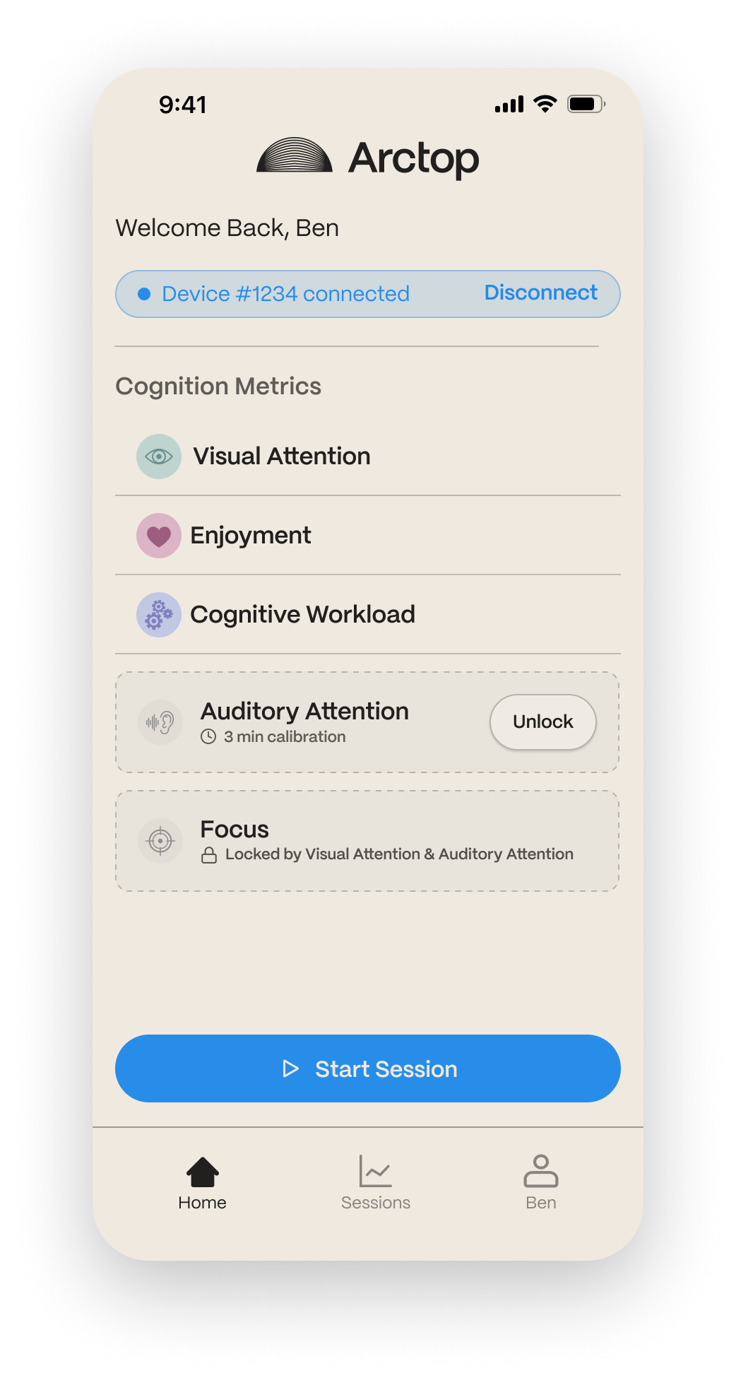
Dashboard and Navigation
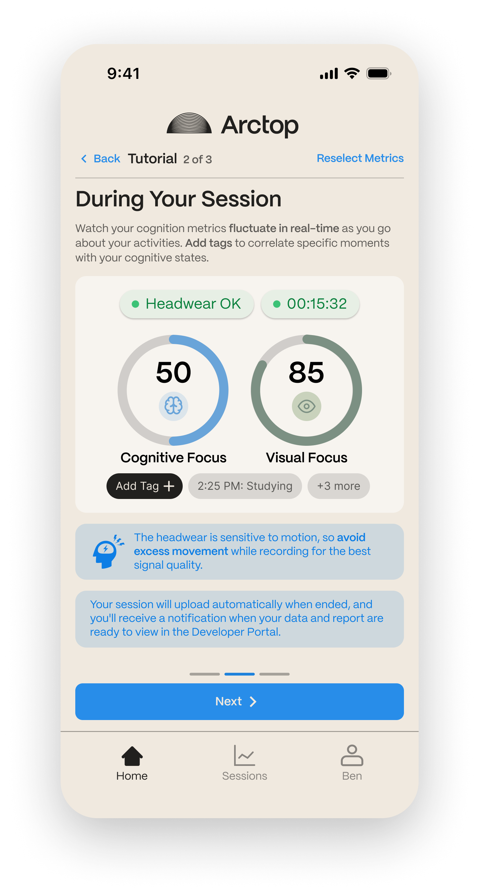
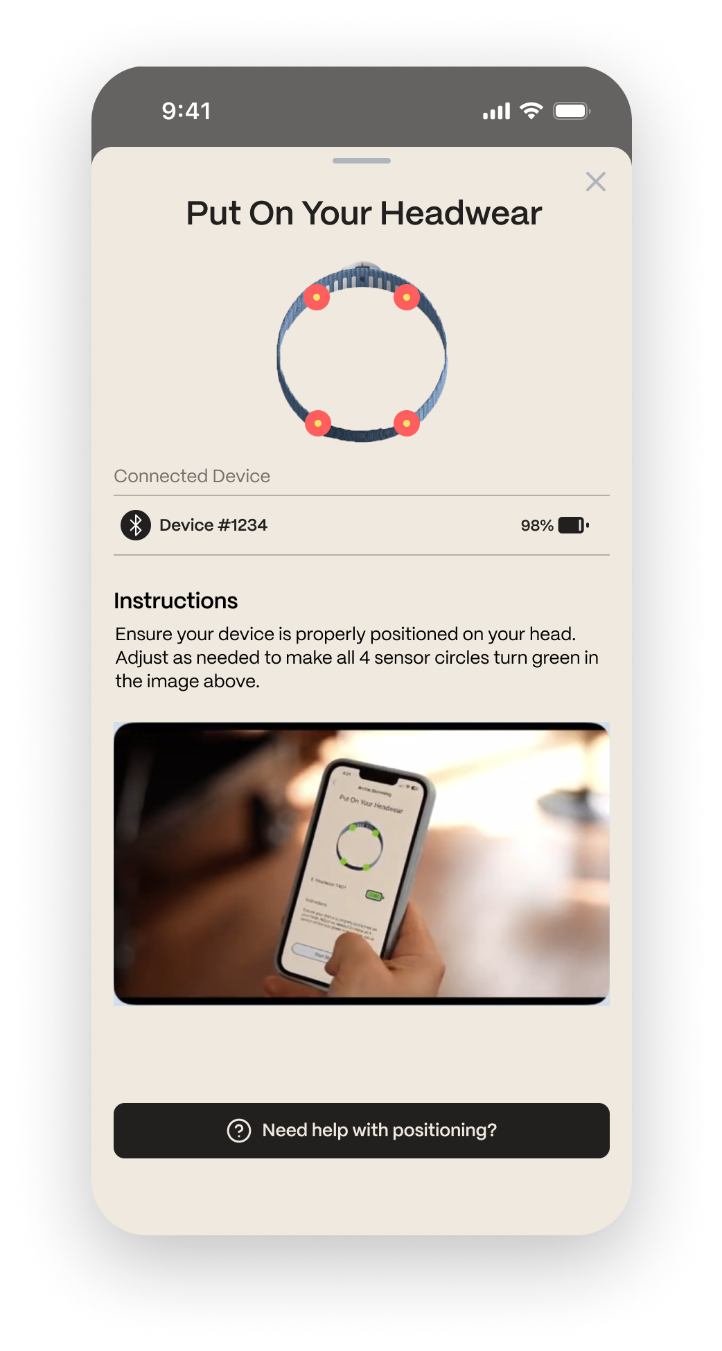
Tutorial and Calibration
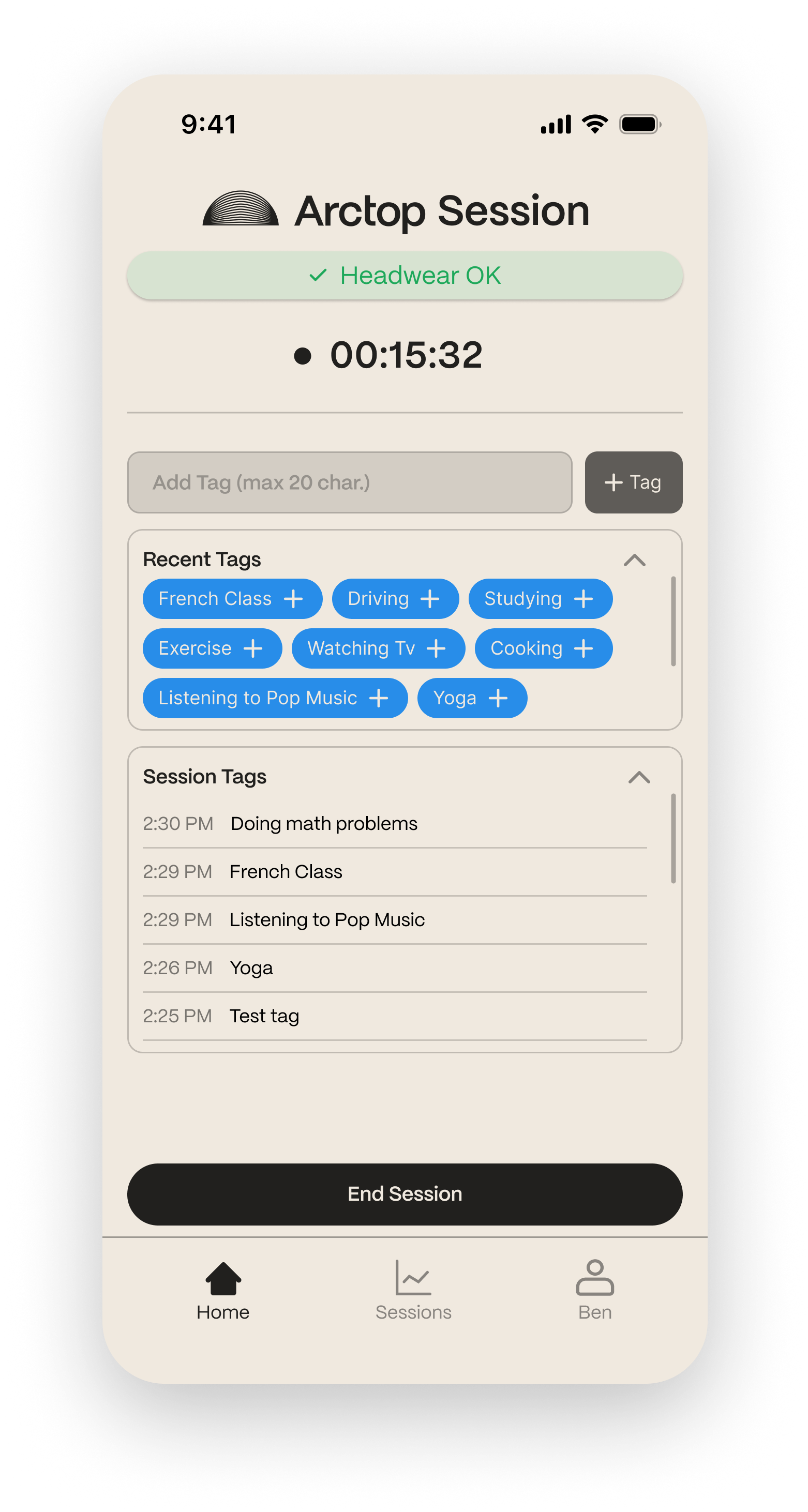
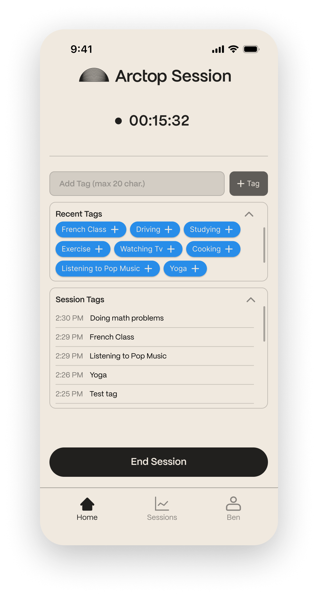
Recording Session
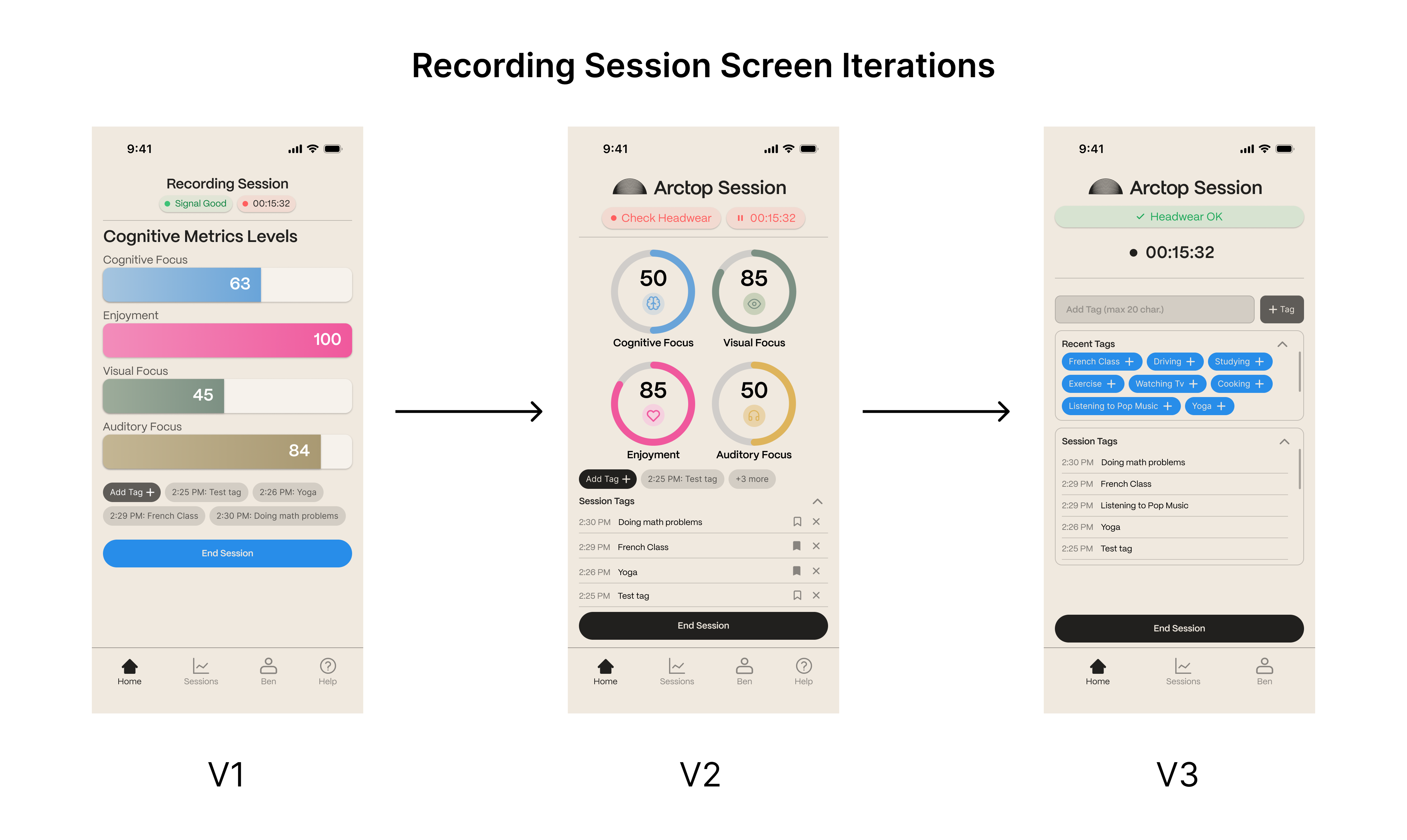
Iterative Testing
Conducted multiple rounds of usability testing and refined the design based on feedback.
Solution
Tutorial & Calibration Process
Transforming the calibration process into an intuitive and engaging experience.
Dashboard & Navigation
Establishing multiple metrics on homepage for calibration and selection.
Recording Session
Streamlining the recording process for better usability and efficiency.
Onboarding Flow
Conducting multiple rounds of usability testing and refining the design based on feedback.
